Ask any space, science, or astronomy enthusiast about NASA's Asronomy Picture of the Day and they will probably gush about it. Launched in 1995, APOD has served the public with a new beautiful astronomy-related picture every day for the last 21 years. APOD is one of the most popular government websites, drawing over 1.5 million visitors per month.
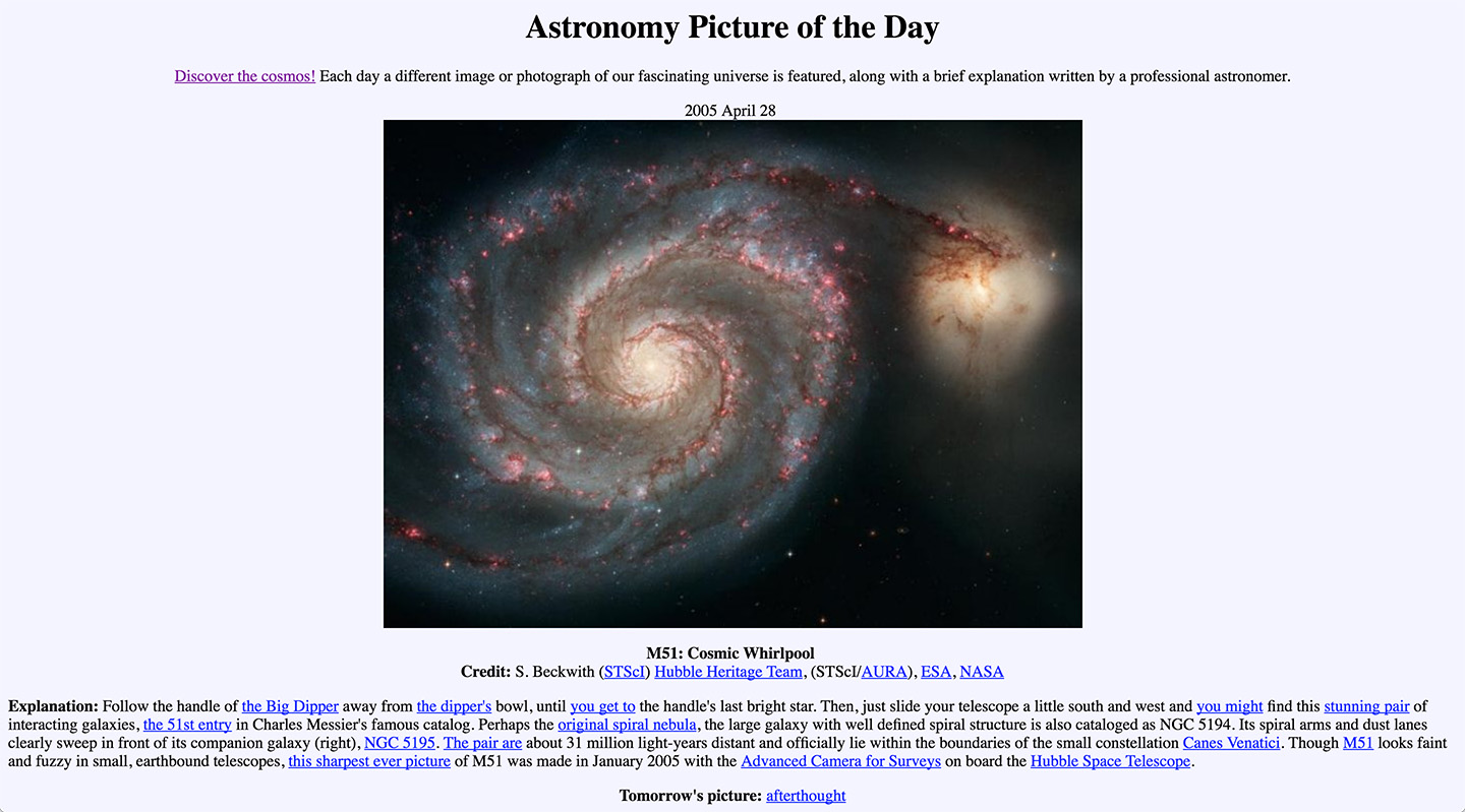
For being such a beloved government service, the visual design and UI of Astronomy Picture of the Day is outdated to say the least. The interface has not been significantly updated in decades, and visiting the site is like going back to a time when dial-up modems ruled the land and Google hadn't been invented yet.

NASA's current Astronomy Picture of the Day interface
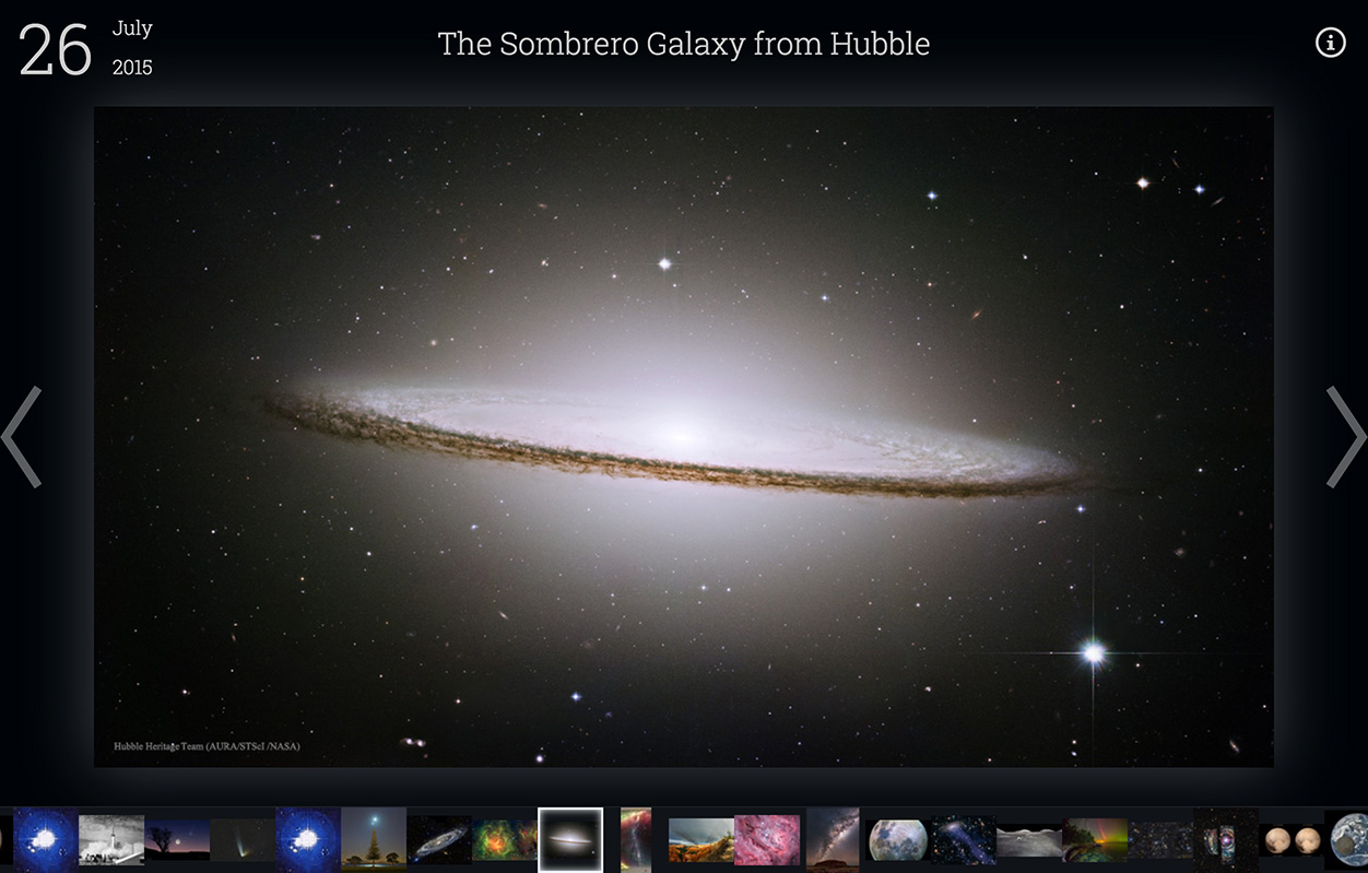
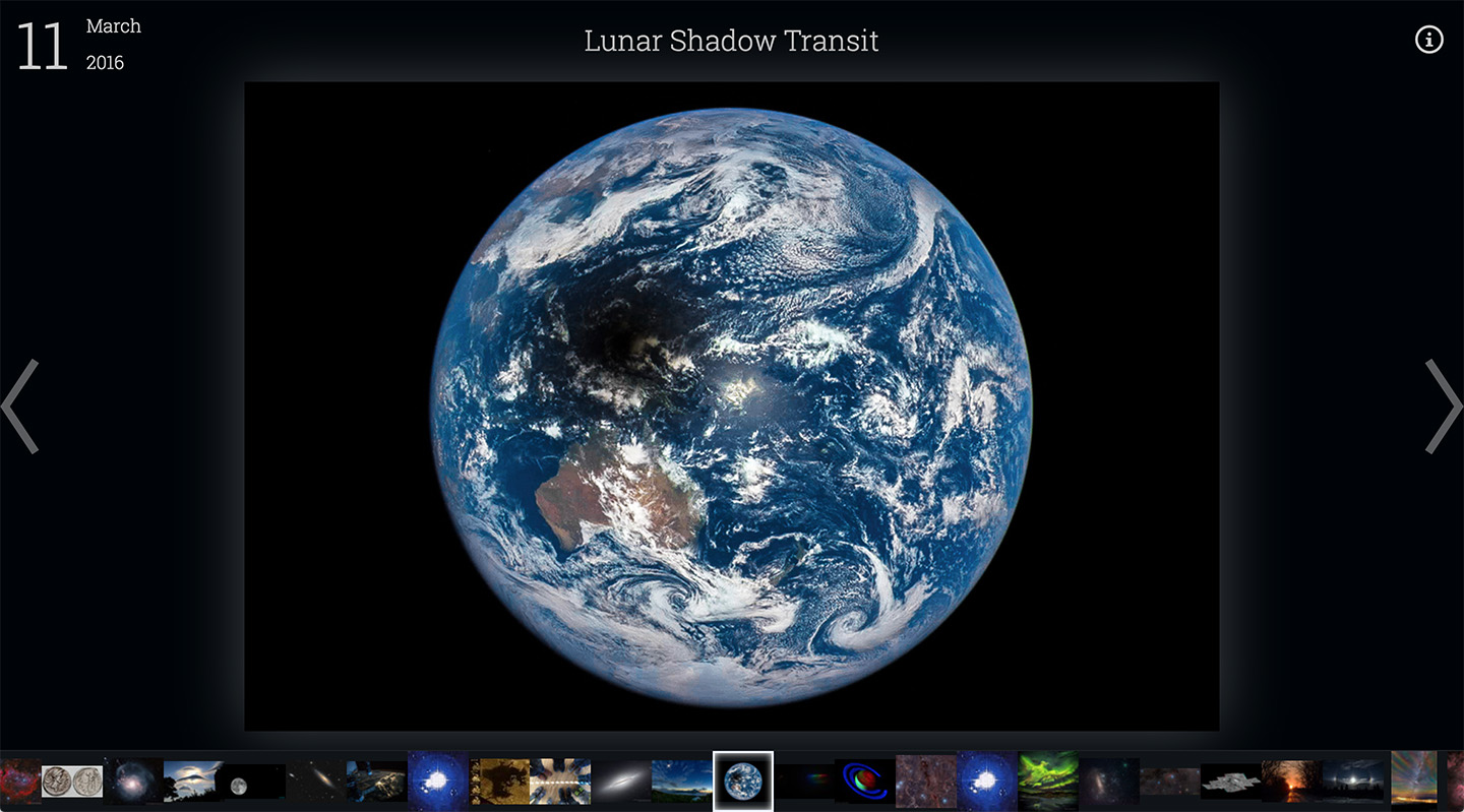
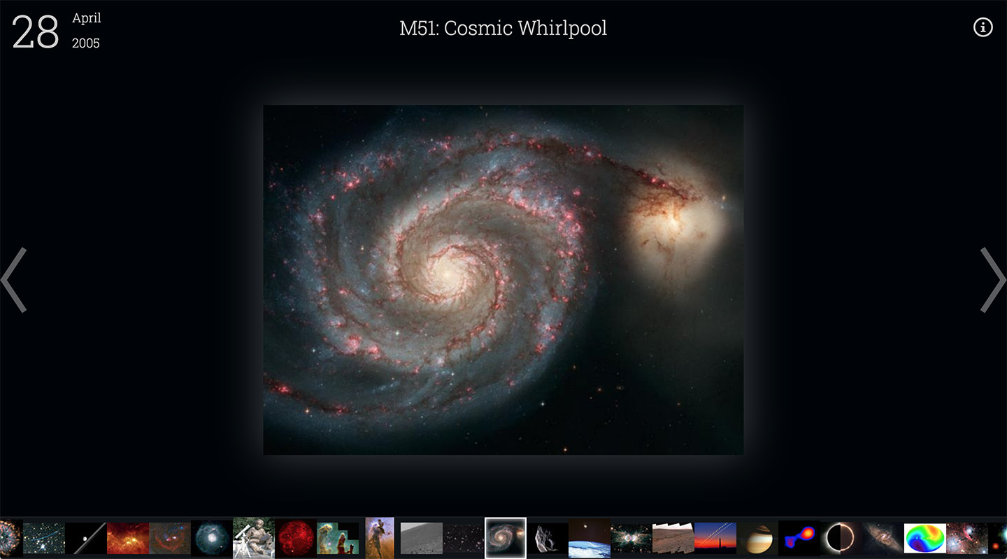
I decided to apply my skills as a UX designer and frontend developer to update the APOD website for the modern web. My goal was to make browsing the image gallery more streamlined, intuitive, and accessible. I call my new and improved version "APOD 2.0". Many improvements have been made, including:
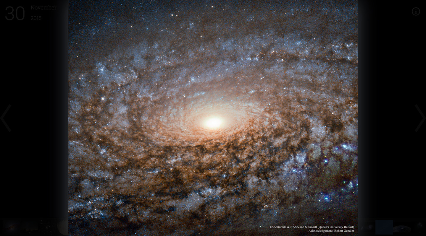
- Dark color scheme better showcases space imagery
- Keyboard arrow key navigation enables rapid browsing
- Scrollable filmstrip gives a preview of dozens of images
- Intelligent image preloading increases speed
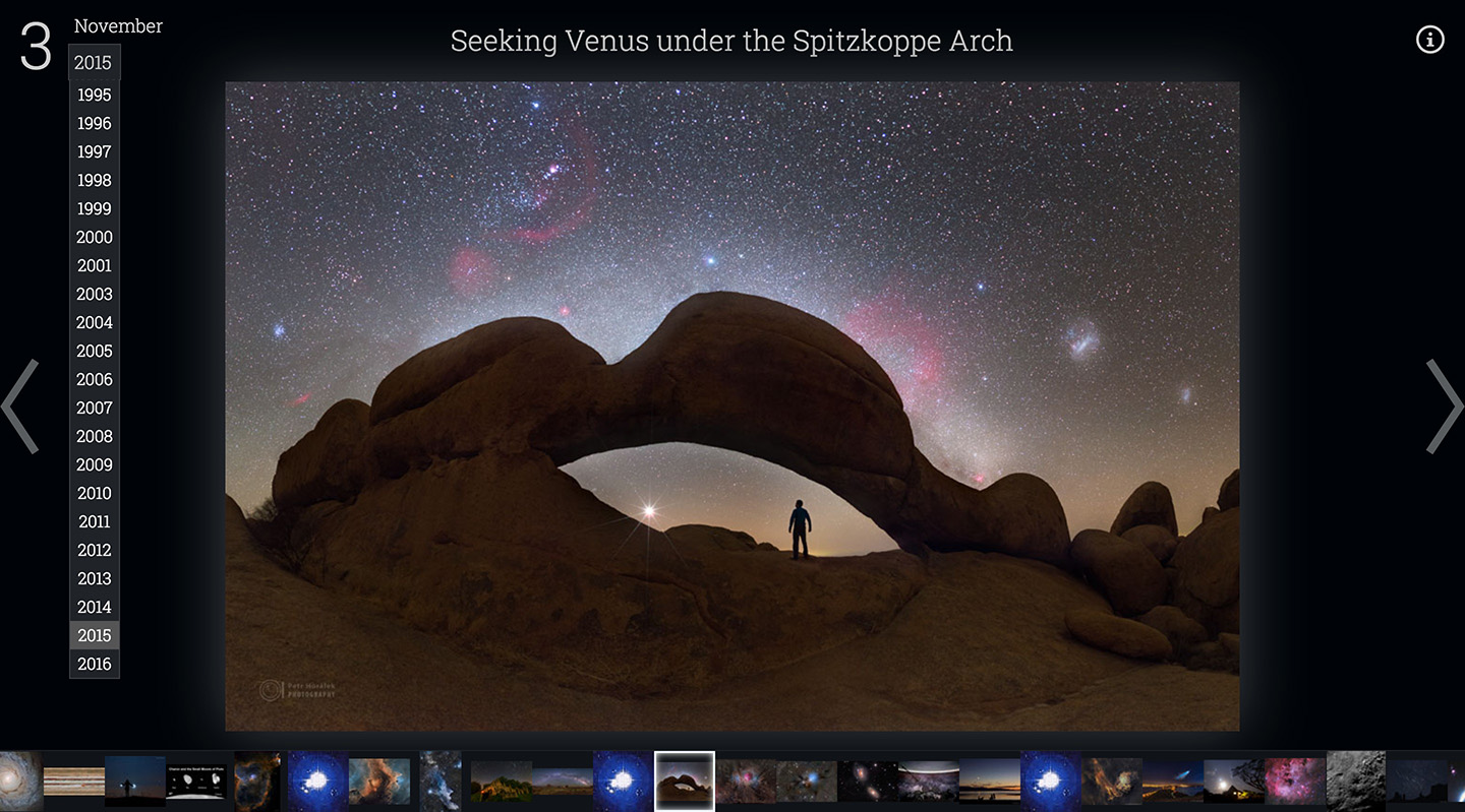
- Dropdown selection makes it easy to select a specific date
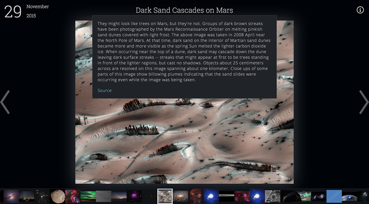
- Nonessential info is hidden in hover states to keep focus on the imagery

My updated Astronomy Picture of the Day interface, "APOD 2.0"
The heavy lifting in the project is done by React.js, Facebook's amazing UI library. I chose React.js because it let me easily encapsulate interactive components like the filmstrip, thumbnails, and date picker. jQuery was also used for its convenient AJAX capabilities, and GreenSock Animation Platform (GSAP) provides some animation muscle.
Special thanks goes to NASA for making their APOD API public, without which this project would not be possible.
APOD 2.0 is open source under the GNU GPL 3.0 license, and is available on github.com. It is an ongoing project which I am constantly trying to improve upon. Future feature TODO list includes search, tagging, slideshow, and alternate navigation modes.

Click an image to quickly view a high resolution full screen version

Detailed image description is revealed by hovering the title

Specific dates can be navigated to in seconds via dropdown
